Go back

How to create an handwriting animation?


Introduction

Let's see together how to reproduce the following animation:

This type of animation is not as easy to create as it might seem, and we're going to try to reproduce it in two steps. First, we'll recreate the effect with a simple line to grasp the logic and then we'll see how to apply it to more complex shapes such as letters or other intersecting outlines.

ICON
Used tools

In this little guide, I'll be using Inkscape to create SVGs. This software has the advantage of being available for free on Linux, Mac and Windows.

As for the animations themselves, I'll show you how to make them both with traditional CSS but also with Framer Motion which I find very handy for making animations.

Animating a simple shape

Preparing the SVG with Inkscape

Let's start by creating some simple text with Inkscape. Two letters will suffice for now.

A text in Inkscape.

Then use the pen tool to go over all the letters in a single stroke. There's no need to be precise, just try to go over the letters and make sure your line covers everything (you can always adjust the line afterwards).

Then define a cut-out.

Finally, resize your SVG to the size of your text and then export the SVG by choosing ‘Optimised SVG’ as the save format.

ICON
Tips
Use Ctrl+Shift+R to resize the SVG.
ICON
Warning

If you integrate your SVG text into your site in this way, it may not be displayed in the correct font. There are two possible adjustments you can do, depending on how you want to use it:

  • If you need to retain the text properties of the SVG (allowing the user to select the text, for example), remember to include the SVG font in your @font-face.
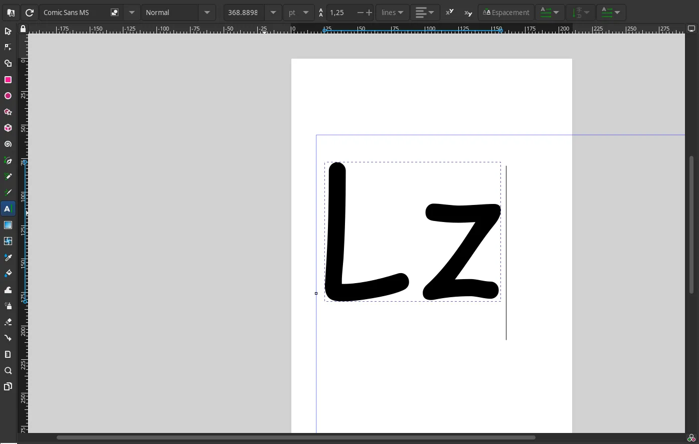
  • Otherwise, you need to convert your text into a path. To do this in Inkscape, select your text, click on path then object to path (or do Shift+Ctrl+C depending on your OS).

Note: a third solution might have been possible with SVG fonts but there is insufficient support for these to be used.

Congratulations, your SVG is ready! Let's get animating.

Animating the SVG

With vanilla CSS

Before we can animate your SVG, we need to determine the length of the path, i.e. the line you've drawn. To do this, add a class to your SVG to select it easily. Then display your SVG in your application and in your browser console, use:

document.querySelector('.my-class path').getTotalLength();
This will give you the path's length. Remember this value, we'll use it later.

Récupération de la longueur du SVG.

You can now add this value to the stroke-dasharray property in your CSS style sheet. This will allow us to animate the stroke-dashoffset property like this:

.simple-svg {
stroke-dasharray: 432;
animation: 0.4s draw linear;
}
@keyframes draw {
0% {
stroke-dashoffset: 432;
}
100% {
stroke-dashoffset: 432;
}
}

With Framer Motion

If you're using Framer Motion, all you need to do is animate the pathLength property . To do this, start by defining the variants of your animation:

const pathVariants = {
initial: {
pathLength: 0,
},
animate: {
pathLength: 1,
transition: {
duration: 3,
ease: 'easeInOut',
},
},
};

Then replace your path with a motion.path and link your variants.

export default function AnimatedSvg() {
return (
<svg>
{/* ... */}
<motion.path
variants={pathVariants}
initial="initial"
animate="animate"
d="m34.398 64.953-2.7437 …"
clipPath="url(#clipPath2)"
fill="none"
stroke="#f00"
strokeWidth="16.165"
></motion.path>
</svg>
);
}
ICON
Warning

Remember to rename the properties of your SVG using camelCase! For example, you'll need to rename the stroke-width property to strokeWidth for the SVG to remain valid in your JSX.

Congratulations, you've just created a simple animation! Now let's see how to deal with more complex figures.

Animating a complex shape

What's the problem?

To understand the limitations of the previous solution, let's try animating a loop using the same process:

As you can see, the animation is less convincing convincing because the intersecting lines cause an overflow effect. To overcome this problem, we need to make several sections.

Preparing the SVG with Inkscape

Let's take the example of this loop again. To begin with, we need to cut the initial shape into several sections, so that each section can be drawn without overlapping. To make your cuts more visible, you can colour in each section.

Then go through each section with the pen tool (more precisely than me if you can).

Finally, define your cut-outs.

You can now export your SVG as described above and move on to the next step.

Animating the SVG

With vanilla CSS

ICON
Warning
Warning: Inkscape may automatically add certain styles such as stroke-dasharray:none. Remember to remove these styles for the animation to work!

As we have several paths, this time we need to retrieve the length of each path. To do this, add a class to each path and retrieve the length using a:

document.querySelector('.my-class path').getTotalLength();

Now that we have the lengths, we need to determine the duration of each animation in order to apply a delay and have a consistant result. Let's start by determining the total duration of the animation.

To obtain the duration of each section, we'll start from the total duration of the animation (which we'll arbitrarily set at 4 seconds) and then perform cross-multiplications:

Path Length Duration
Path a 71 (4 x 71 ) / 232 = 1.2
Path b 161 (4 x 161) / 232 = 2.8
Total length 161 + 71 = 232 4s

You now have all the values you need to animate your SVG:

.part-a {
stroke-dasharray: 71;
animation-name: drawa;
animation-duration: 1.2s;
animation-fill-mode: forwards;
animation-timing-function: ease-in;
}
.part-b {
stroke-dasharray: 161;
animation-name: drawb;
animation-duration: 2.8s;
animation-delay: 1.2s;
animation-fill-mode: forwards;
animation-timing-function: ease-out;
/* Used to ‘hide’ the path in its initial state. */
stroke-dashoffset: 161;
}
@keyframes drawa {
0% {
stroke-dashoffset: 71;
}
100% {
stroke-dashoffset: 0;
}
}
@keyframes drawb {
0% {
stroke-dashoffset: 161;
}
100% {
stroke-dashoffset: 0;
}
}
ICON
Tip

Don't forget to play with the timing functions to get a livelier effect depending on the number of elements. For a simple effect, simply use an ‘ease-in’ on the first path, a ‘linear’ for the intermediate paths and an ‘ease-out’ for a smooth conclusion.

With Framer Motion

This time, there are several possible approaches to animating SVG. As in the field of animation it is often necessary to make small adjustments to make the movement more lively, I will present here an approach that may be laborious if you are faced with a large number of paths, but which will have the advantage of being easily customisable.

The first step will again be to determine the length of each path and calculate the duration of each animation. You can do this directly in your component if you wish (by putting a ref to each path, but I find it preferable to do it directly in the browser because from a performance point of view it saves a few calculations when the page loads and it simplifies the code a little.

Once you have your values, all you need to do is create your variants:

const pathVariants = {
initial: { pathLength: 0 },
animate: { pathLength: 1 },
};

Then add the value of your durations and delays to your paths:

export default function AnimatedSvg() {
return (
<svg>
{/* ... */}
<motion.path
variants={pathVariants}
initial="hidden"
animate="visible"
transition={{
duration: 1.2,
ease: 'easeIn',
}}
className="part-a"
d="m34.398 64.953-2.7437 …"
clipPath="url(#clipPath2)"
fill="none"
stroke="#f00"
strokeWidth="16.165"
></motion.path>
<motion.path
variants={pathVariants}
initial="hidden"
animate="visible"
transition={{
duration: 2.8,
ease: 'easeOut',
delay: 1.2,
}}
className="part-b"
d="m 113.33149,125.61735 6.18181,0.60672..."
id="path16"
clipPath="url(#clipPath20)"
></motion.path>
</svg>
);
}

Well done, you've done it! I hope this short guide has helped you to make this animation. If you want to go further, go to the next section for some additional resources ;-)

Ressources